Tuesday, September 25, 2007

Interview with Graphic Designer, Cornelia Flak


Cornelia Flak, Freelance Graphic Designer, Hamburg Germany. Interview by cathy campbell.

Q1. Did you begin your career with training or study? Where? And a brief overview of your career?

Yes, with study. One year at a private graphic Design School (well respected but I had to pay for) as I wasn’t accepted into Uni. In 1989 I got into the University of Applied Arts in Hamburg that had the best reputation (and in those days, mostly free education). Communication Design for 3 years with Diploma for one year at the end. Throughout my study I worked always in advertising agencies for experience. Several while I studied.
After the second semester of Uni we exhibited our work in an exhibition. From this one of the best creative advertising agencies came, Jung Von Matt (google them…they’re really big!) and they offered me to work for them. So I actually started freelancing for them during my study years.
1999. 3 months in London in a design company. Also Berlin for 2-3 months in 2000.
Then I finished my studies and I started work in a big creative design company in Hamburg, Springer & Jacoby. Also worked for a television company and for Mercedes Benz as a graphic designer.
I started doing just layout of campaigns with some imput of little ideas as the Art Directors did most of the big ideas.
Then Australia for one year backpacking. I travelled and painted kooky souvenirs in Darwin at the markets and painted vans, like for friends travelling around. One van I covered in red dragons, all freehand.
The last 3 and a half years I have been self-employed in Hamburg. Usually contract work or project-based work for clients- anything from one day to 6 months and it’s going well. These days I work for half the time and get paid double the money so it’s good.

Q2. When you studied did you consider anyone to be a mentor? Or were you inspired by anyone?

My teachers at Uni in particular. They supported me getting work experience while I studied. They liked that I was independent and good at the work. And they were very encouraging.

Q3. What kind of Graphic Design do you mostly do now?

Now…everything that is going to be printed…. brochures, flyers. I like InDesign. Corporate designs, logos and business papers (letterheads) and cards. Websites, but not doing the programming, just the artwork.

Q4. Over the years have you developed a unique design style? Or can you describe how you work?

Probably, but it’s difficult to describe my style. I know I am reliable for my clients. Quick. I can’t do anything that doesn’t look nice. It can’t look cheap. Everything I do is very colourful because of my artistic background.

Q5. Describe your studio and the set-up you have?

70% of my work I do at home.
15” laptop Mac Powerbook G4 and another monitor.
Indesign. Illustrator. Photoshop and Quark Xpress.
Scanner.
No graphics tablet.
DVD burner.
Colour laser A4 printer
…and the fastest Internet connection possible.
I usually send pdf’s, not much printing. I just send the files.

Q6. When you get a brief where do you start?

Always I have a little brainstorming. Then I make sketches. It’s possible I inform myself about the product and client’s competition. Then I just make something up. Mostly I don’t look at what other graphic designers are doing – not so much magazines and current journals. I just do it myself.

Q7. What are your favourite jobs?
I like to do advertising campaigns for young and wild products or clients. Then I can create work I call “freaky” or “totally gaga”. If you look on my website I created an Ad for a Jeans brand that doesn’t exist. I’ve also created some funky jewellery…guitar plectrums as earrings. I also like doing advertising for cars in particular.

Q8. What jobs make up your basic income?

I have a lot of Pharmacy clients. They are my nice paying, very good bread and butter clients. They are nice people too. The work isn’t so creative but just good.

Q9. What advice would you give to someone starting out as a graphic designer?

Get as much work experience as you can and work in as many companies as you can. When someone asks if you can do a job...just say yes…then learn fast how to do whatever it is you need to learn to do that job. If it’s, say, a Photoshop thing ask people til you get someone to tell you. And make as many connections as you can. In Germany we call it the Vitamin B theory. Because the word for Vit.B is connections. Connections will get you on your way.

Q10. How do you get most of your work/promote yourself?

Word of mouth. Website. And pdf portfolio. Everything is online. I just send the portfolio as a multiple page pdf. I also have a freelancing agency. And they call me. They get 10% of any job that job.

Q10. What do you think is most important to a client?

To be fast, quick and do good work that everyone can understand.

Q11. How would you describe what is “cutting edge” in design? Can you describe changes in trends over the time you have been working?

Yes, there have been many changes. Typographically, well a while back everything was so Helvetica, it still is in a sense. In ’98 David Carson style text was influential…you know words overlaid on each other. Everyone was oriented that way. But now it’s simpler and so pure. Cooler. Separate. With colours there are changes every 4 to 5 years.

Q12. Is there any area you would like to branch into/explore/develop?

I would like to open up an Advertising Agency. A very creative, different one. Finding the right people to do that with is the hardest thing. I haven’t found them yet.
I would rather have kids as well I think. I am 32. I think that would be good.

Q13.Who inspires you now?

My meditation. My meditation gives me a lot more creativity.

Q14. What do you do when you cannot get inspired for a particular job; you know get a creative block?

Go for a walk. Try doing something else for a few hours. Try to shift. Have a shower…I get some of my best ideas in the shower.

Q15. What was one of your most successful/enjoyable jobs?
The Mercedes-Benz AMG Advert. The teaser and the follow-up. The ads worked together. Its on my website ( http://www.frauflak.de/ ). The ad won a bronze medal in the German Art Director’s Club.

Q16. What was one of your worst?

I had to do a package for a haemorrhoid cream- a relaunch. I had to put a really yucky green in the typography. I admit the client and I laughed a lot over that.

Q17. Do you prefer to work solo or in a team?

Solo. Both are good in different ways.

Q18. Do you have any “pet hates” when it comes to design work?

We call it dialogue marketing. Everything that comes into your letterbox. And catalogue design.

Q19. How does being a graphic designer interrelate to the different aspects of your life? Do you think you see the world differently?

It totally does effect how I see the world. My experience of looking at the world. I get very excited about what I look at. I like your kitchen wall…with your Italian plates. That’s why I do the job I do. I like it.

Q20. What is the most enjoyable/satisfying part of being a graphic designer?

Being creative and writing bills (ha!ha!) and seeing the things you have done outside in the world. Like, “that was my first logo”, and maybe you can bring a little bit of your world into the world of others.
I would like to make the world a little better!

Cornelia’s website is… http://www.frauflak.de/

Interview with Graphic Designer, Cornelia Flak


Interview with Cornelia Flak, Freelance Graphic Designer, Hamburg Germany.
Q1. Did you begin your career with training or study? Where? And a brief overview of your career?

Yes, with study. One year at a private graphic Design School (well respected but I had to pay for) as I wasn’t accepted into Uni. In 1989 I got into the University of Applied Arts in Hamburg that had the best reputation (and in those days, mostly free education). Communication Design for 3 years with Diploma for one year at the end. Throughout my study I worked always in advertising agencies for experience. Several while I studied.
After the second semester of Uni we exhibited our work in an exhibition. From this one of the best creative advertising agencies came, Jung Von Matt (google them…they’re really big!) and they offered me to work for them. So I actually started freelancing for them during my study years.
1999. 3 months in London in a design company. Also Berlin for 2-3 months in 2000.
Then I finished my studies and I started work in a big creative design company in Hamburg, Springer & Jacoby. Also worked for a television company and for Mercedes Benz as a graphic designer.
I started doing just layout of campaigns with some imput of little ideas as the Art Directors did most of the big ideas.
Then Australia for one year backpacking. I travelled and painted kooky souvenirs in Darwin at the markets and painted vans, like for friends travelling around. One van I covered in red dragons, all freehand.
The last 3 and a half years I have been self-employed in Hamburg. Usually contract work or project-based work for clients- anything from one day to 6 months and it’s going well. These days I work for half the time and get paid double the money so it’s good.

Q2. When you studied did you consider anyone to be a mentor? Or were you inspired by anyone?

My teachers at Uni in particular. They supported me getting work experience while I studied. They liked that I was independent and good at the work. And they were very encouraging.

Q3. What kind of Graphic Design do you mostly do now?

Now…everything that is going to be printed…. brochures, flyers. I like InDesign. Corporate designs, logos and business papers (letterheads) and cards. Websites, but not doing the programming, just the artwork.

Q4. Over the years have you developed a unique design style? Or can you describe how you work?

Probably, but it’s difficult to describe my style. I know I am reliable for my clients. Quick. I can’t do anything that doesn’t look nice. It can’t look cheap. Everything I do is very colourful because of my artistic background.

Q5. Describe your studio and the set-up you have?

70% of my work I do at home.
15” laptop Mac Powerbook G4 and another monitor.
Indesign. Illustrator. Photoshop and Quark Xpress.
Scanner.
No graphics tablet.
DVD burner.
Colour laser A4 printer
…and the fastest Internet connection possible.
I usually send pdf’s, not much printing. I just send the files.


Q6. When you get a brief where do you start?

Always I have a little brainstorming. Then I make sketches. It’s possible I inform myself about the product and client’s competition. Then I just make something up. Mostly I don’t look at what other graphic designers are doing – not so much magazines and current journals. I just do it myself.

Q7. What are your favourite jobs?

I like to do advertising campaigns for young and wild products or clients. Then I can create work I call “freaky” or “totally gaga”. If you look on my website I created an Ad for a Jeans brand that doesn’t exist. I’ve also created some funky jewellery…guitar plectrums as earrings. I also like doing advertising for cars in particular.

Q8. What jobs make up your basic income?

I have a lot of Pharmacy clients. They are my nice paying, very good bread and butter clients. They are nice people too. The work isn’t so creative but just good.

Q9. What advice would you give to someone starting out as a graphic designer?

Get as much work experience as you can and work in as many companies as you can. When someone asks if you can do a job...just say yes…then learn fast how to do whatever it is you need to learn to do that job. If it’s, say, a Photoshop thing ask people til you get someone to tell you. And make as many connections as you can. In Germany we call it the Vitamin B theory. Because the word for Vit.B is connections. Connections will get you on your way.

Q10. How do you get most of your work/promote yourself?

Word of mouth. Website. And pdf portfolio. Everything is online. I just send the portfolio as a multiple page pdf. I also have a freelancing agency. And they call me. They get 10% of any job that job.

Q10. What do you think is most important to a client?

To be fast, quick and do good work that everyone can understand.

Q11. How would you describe what is “cutting edge” in design? Can you describe changes in trends over the time you have been working?

Yes, there have been many changes. Typographically, well a while back everything was so Helvetica, it still is in a sense. In ’98 David Carson style text was influential…you know words overlaid on each other. Everyone was oriented that way. But now it’s simpler and so pure. Cooler. Separate. With colours there are changes every 4 to 5 years.

Q12. Is there any area you would like to branch into/explore/develop?

I would like to open up an Advertising Agency. A very creative, different one. Finding the right people to do that with is the hardest thing. I haven’t found them yet.
I would rather have kids as well I think. I am 32. I think that would be good.

Q13.Who inspires you now?

My meditation. My meditation gives me a lot more creativity.

Q14. What do you do when you cannot get inspired for a particular job; you know get a creative block?

Go for a walk. Try doing something else for a few hours. Try to shift. Have a shower…I get some of my best ideas in the shower.

Q15. What was one of your most successful/enjoyable jobs?

The Mercedes-Benz AMG Advert. The teaser and the follow-up. The ads worked together. Its on my website. The ad won a bronze medal in the German Art Director’s Club.

Q16. What was one of your worst?

I had to do a package for a haemorrhoid cream- a relaunch. I had to put a really yucky green in the typography. I admit the client and I laughed a lot over that.

Q17. Do you prefer to work solo or in a team?

Solo. Both are good in different ways.

Q18. Do you have any “pet hates” when it comes to design work?

We call it dialogue marketing. Everything that comes into your letterbox. And catalogue design.

Q19. How does being a graphic designer interrelate to the different aspects of your life? Do you think you see the world differently?

It totally does effect how I see the world. My experience of looking at the world. I get very excited about what I look at. I like your kitchen wall…with your Italian plates. That’s why I do the job I do. I like it.

Q20. What is the most enjoyable/satisfying part of being a graphic designer?

Being creative and writing bills (ha!ha!) and seeing the things you have done outside in the world. Like, “that was my first logo”, and maybe you can bring a little bit of your world into the world of others.
I would like to make the world a little better!

Thursday, August 2, 2007

Bea Pierce ~ Senior Graphic Designer...........by Jo


01. How did you begin your career - formal study or otherwise; where, how long, would you do it again or is there an alternative?

I completed a two-year Associate Diploma in Graphic Art at the University of Western Sydney, Nepean in 1991.

I came through uni on the cusp of the first ‘digital revolution’ to hit the design industry. At uni, we learnt about bromides, Letraset, typesetting (the old way) and hand-rendering. By the time we graduated, the industry had moved on to using computers for pretty much everything and I had to learn fast, from scratch!

We did have computers at uni – about 8 between 60 students, and 1 hour of computer studies per week. The software we had was Letraset Studio, OmniPage Pro and Typestyler. Letraset Studio was a precurser to Quark Xpress, which had already become the industry standard when I left uni. Photoshop, Illustrator and PageMaker were available, but not in common use in 1991 – or at least, not at uni anyway!

Because of this, and the fact that in 1992, when I began looking for work, we were in the middle of the ‘recession we had to have’, it took me almost 12 months to finally crack my first design job.

During that 12 months, I applied for hundreds of jobs, usually along with hundreds of other hopefuls. Because of the recession, experienced designers and even art directors were applying for junior positions, so it was very very tough to break into the industry – especially with no computer or on the job design experience. While trying to get in as a designer, I worked as a word processor, a printer in a photo lab, a technical illustrator for a small building contractor and a Santa photographer!

I finally got my break by offering myself on a two-week free trial period or as a no-strings-attached work experience temp; anything to get a foot in the door and pick up computer skills. A few companies took me up on this, and luckily, I’m a quick learner, so I picked up enough skills in Quark, Illustrator and Photoshop to eventually be able to scam my way through an interview and skills test to land a junior position in a publishing company.

Would I do it again? Probably. But I’d do a degree not a diploma (more theory and more comprehensive). Most people will learn more on the job than they’ll ever learn at uni, but it does make it easier to break into the industry if you have the bit of paper.

If you’re a talented designer, have done art or design at high school (if you’re a junior), have a comprehensive knowledge of the software used professionally and a strong portfolio, you could probably avoid doing a course and land a job on the strength of your folio alone, but you’d be incredibly lucky to be able to do this.

02. What inspired you to become a designer?

Oddly enough, I never wanted to be a designer; I wanted to be a photographer. There wasn’t really a specific photography course, so I agonized over whether to study graphic art or visual art, and eventually decided on graphic art because it offered more definite employment opportunities at the end.

The publishing company who took me on actually gave me a go on the strength of my photographic work over my (non-existent) skills as a designer. I spent two years working there, as both a photographer and designer. What eventually decided my career course for me was being continually rejected by every photography job I went for, except the ones I didn’t want to pursue, such as Santa photography.

That and the fact that the more I learnt about design, the better and the more interested in design I became. It helped that the publishing company I started off in had such a great team of people. I made several life-long friends there and loved the experience. I was encouraged and nurtured, pushed and allowed to grow. When I had outgrown the role there, my boss gave me wings and helped me find new challenges. I was very lucky to have had such a great start really.

03. Describe your own design style.

Ugh. I’m never very good at this. Um…. I guess flexible.

One of the things that I found the most challenging to come to terms with as a designer, is that 90% of the time, you’re not designing for you; you’re creating commercial art. So it’s not about you or your style, it’s about what is most appropriate for the job at hand.

My art is often fairly experimental, abstract, political, controlled chaos. And this does come through in my design work – if suitable for the client. But if I’m designing for a blue chip corporate, I can do minimal, clean-line, sophisticated, subtle… I love it when I get a job that allows me to go a bit wild and creative, but to be honest, they’re rare. I like to push boundaries where I can, but also to meet the needs of both client and audience, and solve design problems effectively.

04. How did you feel when you handed your first job over? How did you go through the ranks to where you are now?

Utterly terrified! Proud, scared, nervous… so many conflicting emotions. What if they didn’t like what I’d done? What if I’d misinterpreted the brief? What if I’d (gasp) made a spelling mistake in the headline?? The weight of responsibility, the expense of producing and printing a newspaper, the expectations of advertisers, my own credibility within the company – all of these things came home to me with a very big thump really.

I got to where I am now through sheer determination, tenacity and the willingness to do anything, try anything, admit to mistakes and offer ways to fix them, an almost obsessive attention to detail, good time and project management skills, quick learning and thinking and the ability to intuit or interpret people’s needs, even if they contradicted the brief.

I made a lot of mistakes along the way. I worked excessively long hours (often 14-16 hours a day, 6 days a week for about 8 years) in order to build up my skills and knowledge – something I wouldn’t recommend. It’s detrimental to your health and unfortunately, companies are all too willing to exploit enthusiasm in young gung-ho designers out to prove themselves and establish their careers. I spent a lot of time treading water and almost drowning, taking on projects or responsibilities way beyond my capabilities in order to learn, prove myself or move up the ladder. Much of my ‘spare time’ was devoted to reading, researching, self-training and developing my own experimental design projects, at my own expense.


05. Influences and inspirations of your design career.

When I first started, I was very influenced by designers such as Neville Brody and David Carson. I’ve always loved the work showcased in typographic magazines such as Baseline and photographic magazines such as Black and White. As I got older, I was influenced by the grunge design movement (mid-1990’s) and loved designers such as Dave McKean and Chris Holt. By the late 90’s, I was intrigued with the design work coming out of Sweden (pixel art, cutesy robotic pixel things, lots of flat colour and white or grey) and Japan (more cutesy robotic things, but not so pixel based, lots of stylized graphical objects such as flowers and plants, coupled with simple, harmonious colour schemes). I also got into magazines like Colours (semi-political, international arts, culture and design mag) and Fruits, which although more to do with fashion design than graphic design, still influenced me a great deal.

When the second ‘digital revolution’ swept through the design industry, I switched from print media design to multimedia – or ‘new media’ in about 1995. I was fascinated with notions of interactivity and often frustrated by the limitations of such a new medium, so was inspired by designers and artists who were pushing the boundaries of what was possible. Pip Shea (multimedia artist), VJ’s (working in the rave party scene) and performance artists like Stellarc, who was experimenting with cybernetics and interactivity intrigued me. I became involved with alternative art, music and design collectives such as Artcore and Clan Analogue and met many interesting people experimenting across medias and technologies. IDN magazine was also a big influence for me at this time.

Currently, I mostly look to fine artists for inspiration. I’m mostly interested in abstract art, performance art, installation and conceptual arts. Artists like Basquiat, Antony Gormley and Rosalie Gascoigne and fine art photographers such as Bill Henson. I still love Japanese design and often draw inspiration from fashion and fabric design, architecture and interior design, product design and sculpture as well.

06. What techniques do you use?

Um… I’m not sure I understand the question! Do you mean design process?

07. Favourite areas of design - advertising, painting, typographic, etc.

In multimedia: interactivity, usability and interface design
In traditional media: painting, typography and photography
In both: problem solving, innovating, conceptualising

08. Tools of trade; typical, favourite.

Well, I love working in Photoshop. I’d say that’s my primary tool. I also work in Dreamweaver a fair bit. I sometimes work with Flash, although I don’t really like it much. But my favourite tools are a pen and ink, paint brush and paper. These days, I do less hands-on design work and more conceptual work, so writing, sketching and experimenting with techniques and ideas is often easiest on paper.


09. What strategies do you have to cope with creative blocks?

I always carry a visual diary with me wherever I go. I jot down ideas or sketch things that inspire me wherever I am. Often, these things have nothing to do with anything I’m working on; they’re just things that interest me in the moment. But I love looking back through these books when searching for inspiration for a particular project, as ideas can often emerge from the most unlikely places.

I sometimes do things like go through old encyclopedias or texts on subjects related to a current project, and write down headings, subheadings or any specific words/phrases that jump out at me. Words can often trigger visual ideas.

Walking along a beach or through a forest is a great way to unblock. Taking time to think, slow down, meditate, draw random shapes in the sand. All these things can help shake blockages and get me into the right side of my brain.

If I’m really stuck creatively, I flick through design mags or web folios, looking for ideas – sometimes layout, sometimes colour schemes, sometimes typographical treatments… usually, I’ll sketch anything that grabs me into my visual diary, make notes on colours (by matching colours in a Pantone book) or stick cutouts from magazines etc straight into the book.

10. What extra skills have you learnt working as a freelance and or within a company structure?

o Time management
o Book keeping
o Business management (a little!)
o Project management and planning
o Team management and delegating
o Client liaison
o Writing documentation (such as briefs, design justification docs, specifications and style guides etc)
o People skills – dealing with CEO’s, account managers, sales and marketing people, programmers etc
o In terms of multimedia: cognitive psychology, information design, instructional design
o Teaching and mentoring

11. Do you prefer to work within a team or on your own? Why? Give an example.

For large professional projects, I much prefer to work with a team, as each person specializes in a particular area and brings a much greater depth of knowledge and experience to the project than an individual could. Working with a team produces a much more well-rounded and professional product, especially in terms of multimedia. Trying to be some sort of super Jack Of All Trades is very difficult and stressful. One person simply cannot know enough – or everything – to pull off a multimedia project.

In terms of my role, whether it’s art direction, interface design or something else, I tend to prefer to work alone when coming up with the ideas. But again, once I have some solid concepts, I like brainstorming with other members of the team, especially those specializing in areas beyond my skill to ensure the ideas are going to meet all needs and goals for the project.

I do enjoy freelancing though and working from home. But again, I prefer to freelance for a company and be part of a team than work for my own clients. The projects are generally more interesting and challenging through a company than those I can source by myself! If I do get a challenging project, the first thing I do is form my own team with other freelancers anyway.

12. What are your future ambitions?

Right now, I am very happy lecturing part-time and being at home with my kids while they’re little. Once they’re both at school, I may look at returning to more permanent work – or I may simply take on more teaching work. If I were to return to permanent work, I’d probably want to get back into multimedia, perhaps in a usability design or art direction role. But the one thing I have no desire to do is to return to very long hours and high expectations. My family now takes precedence over my career and I am more interested in being an artist than a designer these days.

My dream is to have a balance between parenting, lecturing part-time and being an artist. As an artist, I am still interesting in exploring interactivity, but in very different ways to the commercial multimedia world!

13. In your years of designing, what changes have you seen? eg: style, use of medium, etc

Blimey… lots!

STYLE-WISE:

o Early 90’s – neat but chunky iconographic style. Everything had rounded edges, typefaces were rounded, pictograms were rounded, everything was influenced by designers like Neville Brody. Lots of white with bright colours like hot pink and orange.
o Mid-90’s – grunge style. Definitely not neat and clean. Chaotic, rebellious, subversive. Typefaces were distorted. Layout pushed out of templates and ordered grids into a more freestyle direction. Reversed typography became very popular – lots of white on black. Very Gothic!
o Late 90’s – pixel art. A return to very clean and structured design, heavily grid-based and influenced by the pixels so prevalent in onscreen design. Everything was square and colour schemes were often subtle, flat colours and white or grey, lots of line work and skeleton or schematic drawings were popular. This movement was driven by designers in the UK, Germany and Sweden. Kinda cyberpunk revivalist.
o Late 90’s/early 00’s – Japanese design. Anime and robotics became a very popular influence with designers and cutesy Japanese anime-esque characters started popping up everywhere. Lots of organic influence design and natural colour schemes emerged. Using white space, a-symmetry and minimalism became popular again.

There were probably plenty of others but these were the ones I noticed and was influenced by.

Since I stopped working as a designer in 2002, I haven’t kept up with design trends through the 00’s – so I have no idea what’s popular now! Although the trend seems to have shifted back to very traditional corporate design styles, particularly in multimedia, and this is largely being driven by the popularity of content management systems – and their inherit layout limitations.


MEDIA/MEDIUM:

Early 90’s – first digital revolution

Introduction of Quark Xpress, Illustrator and Photoshop. When I first started using these packages, they were Quark 1.0 and Photoshop and Illustrator 88.

My first word processing job involved double-shuffling floppy discs on a very early Mac for about 6 months, until the hard drive was invented! At my first design job, my computer had 8Mb of RAM, a 40Mb hard drive and took approximately 15 minutes to rotate an object in Quark Xpress. Using Photoshop was almost impossible, as was working at print resolution. (Afterall, an A4 300dpi image is about 32MB). There was not enough disc space to save print res files, let alone work with them. But it hardly mattered as nobody really understood resolution anyway!

In 1993, we were blown away by the ‘new technology’ available to us – the Syquest drive and the modem. The first Syquest drives had 44Mb of storage capacity – doubling our disc space. And with the modem (about 14.4kbps then) and a program called Telnet (and a lot of learning of prompt lines), we could ‘modem’ our design files to the printers. It took almost 3 days to send the artwork this way. It would have been quicker to send it via courier, but it was more exciting to use the high tech option.

Mid-90’s – computers changed rapidly

I bought my first Mac-clone system in about 1995 (I couldn’t afford a real Mac) and it cost me around $20,000. It was super fast for the time, although you still had to go have a cup of coffee while waiting for Photoshop to do most things on a print res file.

There were a plethora of media types that came and went: Syquest drives, Zip discs, Jazz discs. There were faster modems, CD’s then CD-R’s. Finally RAM and hard drives got into the 100’s of MBs. SCSI peripherals began to be replaced by USB ones and networking became popular. Telnet was replaced with FTP, email replaced office memos and text based bulletin boards morphed into the Intenet.

Mid-90’s – second digital revolution

In 1995, I was interested in getting into ‘digital imaging’. Animation and digital computer graphics were really taking off in the film industry and high resolution digital imaging was popular in the advertising world. There was a lot of money to be made in photo retouching and computer manipulations. But it was still pretty difficult with Photoshop and the limitations of computers then. Small business’ couldn’t afford the high-end professional packages such as Live Picture, so we drank a lot of coffee!

I lucked into multimedia in 1996 through freelance work. Because it was so new, very few designers knew how to design for the internet or multimedia. Programmers were driving the visual aspects, which is why new media looked so awful in the beginning. Because of my Photoshop skills, I started getting work doing early ‘multimedia’ in the form of slides for multimedia presentations (being put together in Powerpoint or Director) or for software packages.

It was a huge learning curve: I had to learn to speak Geek so I wouldn’t be bamboozled by programmers (who detested designers in the beginning), learn to use a PC instead of a Mac (programmers hated Macs and cross-compatibility was a big issue then) and learn to work in pixels instead of dots, RGB instead of CMYK and understand resolution for various screen displays, from computer monitors to TVs.

The Internet was never designed to be a graphical medium; it was a text based medium. Hence the Hypertext bit of HTML. Us web design pioneers had to devise ways to hack HTML to make web pages look visually appealing as more and more companies discovered the power – and cool factor – of having a web page. Web ‘design’ was very restricted for a long time. Everything had to be designed to fit HTML tables, look good in 216 web safe colours (or less) and compressed to the max so that people could download the page(s) on dial up modems.

In terms of multimedia, there are plenty of media types that have now disappeared:
o Hypercard
o Video disc
o Shockwave (a precursor to Flash)
o Mbed
o Mpeg

In 1998, I was the art director for the first McDonalds Australia website. It was designed for Netscape 2.0 and the websafe palette. It was pretty cutting edge in that it was database driven (and hence, even more restricted in terms of design and layout) and featured a games section for kids. Flash was very, very fledgling and was called Shockwave Flash then. Nobody thought it would ever take off. So the company I was working for used Mbed to design the games section. As it turned out, it was Flash that succeeded. Mbed died soon after the site was completed.

Late-90’s

The Web took off. Everybody who was anybody wanted a website, even if they didn’t know why the needed one or what to do with it. There was no standardization, no conventions for design or development and plenty of cowboys. People were earning huge salaries and companies were charging exhorbitant rates for creating web sites, because so few people understood the technology.

Lots of revolutionary web interactions changed the course of multimedia – and offline media as well:
o Online stock trading
o Ecommerce and online auctions
o Community portals such as Yahoo
o Search engines such as Alta Vista
o Online dating
o File sharing and self-publishing, such as Napster
o WhereIs (online street directories)
o Hotmail (email access for people without email accounts)
o Online chat and forums
o Intranets
o Online training and education – course delivery, value adding through training CD’s packaged with software programs etc
o POS displays
o Interactive touchscreen kiosks in museums etc
o Mobile phone technology
o DVDs
o Internet cafes (access to the web for people without computers or web accounts)

The 00’s

The Web is still changing. Now we have a new buzz word – Web 2.0. This refers to the new technology and web usages since the turn of the millennium:

o Google
o Wikipedia
o YouTube
o Second Life
o MySpace, Flickr and other online communities
o Podcasting and vidcasting
o Streaming media, such as online radio stations
o Blogging
o Interactive and digital TV
o Bpay and Paypal
o Google Earth
o GPS systems
o Instant messaging
o Networking and integration between online and offline technologies

14. What do you predict as new trends of design style?

I’m bored with conservative corporate – I’d personally like to see a return to something rebellious and subversive again. Something that will push the boundaries and be a little experimental… it seems that Steam Punk is popular, as is neo-Victoriana, so perhaps a trend towards turn of the (20th) century styles is in order? But it would be nice to see something new rather than something retro I think.

And being a bit of a cyberpunk fan, I’d love to see smart paper and interactive cross-overs into traditional media. But NOT in the form of a fridge with an internet connection… that’s just stupid.

15. What kind of design works have you found to bring in the bread and butter - the most common jobs.

o Web brochures for small companies
o Direct mail and marketing brochures
o Corporate ID, especially business card design for small business

16. What achievements or design works would represent your work?

2001-07 Part-time multimedia design lecturer at KVB Institute of Technology
2002 Art Director for the development of Landcare Australia’s website
2001 Art Director for the development of an online educational website
“Miss Trails House” for the National Trust, for primary school children
Launch of my own online project “CrispyDisc”, a self-publishing tool for independent musicians (now defunct)
1999/2000 Finalist in the IDN Awards for the 5000 Fingers of Dr.T. website
Art Director for the development of two series of training CD-Roms (four in each) to accompany Wilcom design software for the embroidery industry
1998 Invited to design a 5-page spread for Desktop magazine’s special designer issue.
Finalist in the Nocturnal Design Awards for the 5000 Fingers of Dr.T. website.
Art Director for the first McDonalds Australia website
1997 Art Director for Telstra Big Pond national rebranding campaign
(from On Australia)
1996 Finalist in the Macromedia People’s Choice Awards for the Sydney Kings outdoor advertising campaign.

17. What has been the low point of your career? The worst job, the worst client and what did you learn from it?

Hmmm… I once had a job for about a week in a typesetting studio. I don’t remember what it was called or where it was, but I couldn’t stand it! It was like being in one of those horrible boarding schools you hear about. The desks were all in lines, facing the front. There was no talking allowed and if you weren’t using two hands at all times on the keyboard (ie: you couldn’t spend any time thinking, sketching concepts etc), the floor manager would come around and rap you on the knuckles with a ruler – literally! It was so arcane I couldn’t believe it. I had the dubious title of “Art Director” but was not allowed to discuss projects with my minions, which made it very difficult to brief them on what they were required to do.

After a week, I met with the Managing Director and told him what I thought. He was not exactly receptive to some ‘young upstart’ telling him how to run his design department – as I suspected – so I quit. He tried to intimidate me by telling me he’d ensure ‘I never worked in this town again’. What a cowboy!

It taught me a lot about how not to run a business and how not to treat staff, especially creatives.

18. On a day to day basis - what is the most rewarding of your career and the least rewarding?

Right now as a lecturer, I love being able to give back to young designers, inspire them and get them thinking. The least rewarding would be when I have to fail someone.

In terms of design, I love it when I nail a design solution and get everything right with it.

The least rewarding is when clients want to argue constantly over nitty gritty issues such as fonts or colours or second guess professional decisions such as usability or information design aspects they don’t understand, whether they make sense or not, whether they are purely for their own ego satisfaction or not and whether they impact on the bigger picture or not. Getting bogged down with a client who aspires to be a creative is seriously irritating, especially when if their changes fail, it’s you they blame.

19. Do you undertake environmentally sustainable methods of design processes?

When I can. That’s one advantage of multimedia really!

20. Do you, as a graphic designer, feel you have a moral responsibility/obligation to society and how does that make you feel?

Definitely. As a designer, especially in advertising, you are the one creating the stuff, the spin, the hype being shoved in front of people to try to persuade them into taking certain actions or feeling certain ways. And that can cause a lot of internal conflict. I felt conflicted on a daily basis for years when working in advertising and constantly had moral dilemmas.

It’s very difficult to sit in a board room with a bunch of suits from a gambling company and listen to them casually discussing their strategy for getting young men hooked on gambling, to increase their profit margins, with no qualms whatsoever about the impact this may have on their targets. “If they’re stupid enough to fall for it, then they deserve to be exploited” one shrugged at me once.

It bothers me even more now, as a mother.

There have been a few occasions in which I have refused to work on accounts because of my moral concerns about the intent of the client. Mostly, I have been lucky enough to have had the support of my business managers – and in one case, the company refused the account altogether.

It’s great to be in a position in which you can pick and choose what companies you work for and what companies you won’t, on moral grounds, but unfortunately, this is a rare luxury. I do feel it’s important to stand up for what you believe in if you can though, otherwise these companies will continue to get away with exploitation unchecked.

21. How do you establish your hourly rate when presenting the cost to your clients?

Depends on the job. Mostly I have the same rates regardless, but if I’m working for a small company or a charity, I often discount my rate. For some jobs, I’ll provide a flat rate rather than an hourly rate if requested.

22. What does your pricing structure include? eg: fuel costs, person hour rates, materials costs, advertising, etc.

Depends on the job. I usually break down rates into:
o Design development (art / creative direction)
o Implementation (page layout, HTML/CSS/Flash dev etc)
o Complementary creative services (for example, photography or illustration)
o Work changes, alterations etc
o Ongoing maintenance
o Admin costs (for example, travel, material costs for printed proofs, CDs etc)

23. How do you sell yourself? (Is your website your only regular advertising structure/mode?)

I don’t really. People find me through word of mouth now.

But when I was starting out, I registered with freelance agencies such as Desktop People and Equatorial Talent. I joined design communities such as Australian InFront, Design is Kinky and AIMIA. I actively participated in online design forums, wrote product reviews and how-to articles for magazines like Desktop and Publishing Essentials and entered design competitions. I developed an interactive CD folio and sent it to design houses along with my CV when looking for work. I went to trade shows, conferences and seminars and networked a lot. I always have business cards in my wallet and of course, I’ve run my website for about 11 years now.

24. How do you work through client conflict and difficult customers?

He he he… that’s the advantage of working in a team! I leave it to the account managers to deal with those issues.

Of course, as a freelancer, I’ve had the occasional difficult client. One client was a complete nightmare and still owes me money. He did a bunk and even the Sherif couldn’t track him down.

Basically, it’s very important to establish your terms upfront. Make sure that the contract between yourself and your client clearly states fees for work changes. That is changes to the design specification for the job (this is particularly important if their changes require you to start again from scratch), additions or alterations to the content once the design has been signed off – and how many times you are willing to make changes (for example to text content) before you charge them – and beware of ‘feature creep’ as clients are expert at saying, “Can we just add this little thing…?” Cover your back and ensure you have a signed paper trail agreement for every stage of the project. Clients are also experts at blaming you when things go wrong – as are external suppliers such as printers, so paper trails and signed documentation is very important.

25. What would you consider your dream job or dream client?

Um… one with no unrealistic deadlines or expectations, in which I could be as creative and experimental as I liked and everyone would like the end result and not want to second guess anything! Yeah right…

26. How do you maintain ongoing professional development - conferences, updating skills, updating software and materials.

Online tutorials and forums are wonderful things. As is Google. If I don’t know something or need to learn something new, I jump online and research it. I subscribe to forums that interest me so that I get email alerts of upcoming events and forums. And I network, talk to friends and contacts in the industry regularly to keep abreast of what’s happening. I do short courses when I feel the necessity as well.

27. How do you remain progressive in your skill of trade - magazines, study, etc.?

See above!


28. Where do you see yourself in future years? Do you think you will be in the same field or are you interested in other avenues?

Who knows? When I left uni, I’d never heard of the Internet, so could never have predicted I’d have ended up there.

29. Do you think the graphic design industry is high pressured? Well paid?

Yes and sometimes. Some industry sectors pay well, some pay appallingly and operate sweatshops. It’s an unregulated industry, so it all comes down to doing your research on a company and negotiating a good employment package.

30. (What do you think of the new mediums -vapour screens, microsoft mousless coffee tables/interactive softwares, bioplasmic)

Wow! And I thought I was up there on new media! I’ve never heard of any of these, so can’t comment, sorry.

But what I will say is if they’re well designed and thought through, have emotional appeal for the general public and genuine usefulness, they’ll succeed. If not, they’ll disappear and in a few years time, no-one will remember them at all.


I have enjoyed Bea's website and all the talent she displays. This lady seems to really enjoy her chosen career path. I wish her heaps of success and I feel I have come away from this research with a better insight and understanding of this field of art form.

Autobiographical: Bea Pierce
Bibliography: http://www.20-20.org

Wednesday, August 1, 2007

olympic logo..


I dont like it one bit. i think the colours are tacky. it doesnt represtent anything but the nazi symbol.

EMILY - INTERVIEW

INTERVIEW: JENNY MORTON- freelance graphic designer.

EMILY: How did you begin your career – formal study or otherwise Where, how long, would you do that again or is there another alternative?
JENNY: I studied graphic design and its something that ive always wanted to do since I was young. I would do it again. Theres always new things to learn in the industry and I very happy to learn it. I want to leanr as much as I can about the industry. I find it so fascinating and cant wait until I am capable enough to be employed for a big magazine company. Id love to work overseas.
EMILY: How did you feel when you handed your first job over?
JENNY: Haha I was just so happy to have it finished. I agonized over it for so long but my client was very happy so I felt very relieved.
EMILY: Do you think you have a particular style or do you think that you have been influenced by any other designers or movements?
JENNY: I love bold and bright colors that draw attention. Many different designers have influenced me and give me inspiration. I love playing around with text and I think that it one of the most important aspects of the actual design layout.
EMILY: What strategies do you have to cope with mental blocks?
JENNY: I do something that has got nothing to do with the design im doing. Il leave it, go for a walk. Read a book. Haha I even find that if I go shopping il be at the counter buying something and il get this big wash of ideas and I have to borrow the checkout girls pen to jot them down so I don’t forget them.
EMILY: Do you have any future ambitions? Or where would you like to see yourself in 10 years?
JENNY: Wow in 10 years… I’d like to see myself in an amazing magazine company in the uk. I want to be able to travel and work at the same time though. I don’t know just yet how il manage that. But we’ll see.Id even love to learn more about photography and work as a freelance photographer. Then I could incorporate my designs and my own photography togther.
EMILY: What inspired you to become a graphic designer.
JENNY: Im not really sure. Since I can remember ive loved art. Some of my first memories are from children art classes and I studied it all through highschool. Art was the only thing I was ever interested in. Oh dear I was shocking at maths and science. So I think graphic designer is almost like an output of my whole art life where I can make a living from it and love it at the same time.
EMILY: How do maintain ongoing professional development. Conferences, updating skills, updating software and materials?
JENNY: haha im probably a bit behind with all the software.
EMILY: How do you work through client conflict and difficult customers?
JENNY: I just try talking to them. I don’t think theres any point in getting worked up about anything. Its not worth it. If a client deems it neccasary to blow there stack over a design then its best just to walk away. But I do at first try to talk calmly and explain my ideas as much as I can with listening to them as hard as I can.

Saturday, June 23, 2007

lucy's interview with a designer.

01. How did you begin your career – formal study or otherwise Where, how long, would you do that again or is there another alternative: been around it all of my life as that was my dads profession as well, as he owned the business before I did, I had no real formal training, but I worked with my dad as a non official apprentice/ trainee for many years but I have been in the busyness for 10 years full time. And yes I would do it all again!

02. How did you feel when you handed your first job over. It was good to see the sign I designed and made! It gave me self satisfaction and I was proud of it. It was great getting good comments.

03. How did you go through the ranks to where you are now? There were no real ranks as I just took over the business after my father.

04. Describe your own design style. Lots of colour, I use gradients and fading colours together a lot, I try to incorporate pictures and graphics where ever I can.

05. What do you predict as new trends of design style? More photo art and graphics (which is already happening) and mainly more manipulated photos as printers and computers are making these things more possible.

06. Influences and inspirations of your design career. My father, reading sign and design mags and looking at other peoples styles and designs.

07. Tools of trade Typical, favourite: correl draw, sign wizard, digital printer.

08. In your years designing what changes have you seen style: more strait lettering, block colour, 1 dimensional graphics, photo generated artworks from single basic colour to colour blends and photos which are made easier my new technology such as digital technology of the last few years.

09. Favourite areas of design - advertising, painting, typographic etc: mainly typographic- lettering and advertising.

10. What strategies do you have to cope with creative blocks: mainly just go away from the project and do something else eg: make a coffee, work in the workshop for a while, sometimes give yourself half a day or day to work on it in your subconscious. You cant wast time sitting in front of a screen with doing nothing.

11. What are your future ambitions, umm, to retire and get more into photography.

12. Do you prefer to work within a team or on your own. Why Give example: probably in a team because there are more ideas floating around and I like taking and mixing up ideas as well as influence different views and angles.

13. What extra skills have you learnt working as a freelance and or within a company structure. When you come up with a idea which is totally your own with no other influences, it’s a lot harder but a lot more rewarding as it feels better because you have a higher scene of achievement because you know it is all your own I deals.

14. What inspired you to become a designer? I was sick of being an electrician and wanted a change and to do something fun and creative. And because I had been around it and enjoyed it all of my life I thought this was the right path for me.

15. What kind of design work have you found to bring in the bread and butter - The most common jobs. Mainly just general signage like shops and vehicles and that type of thing.

16. what achievements or design projects would represent your best work. Certain well known campaign logos which are continuously seen throughout the years time and time again. Design logos which are still relevant after a period of time and the period of time they were meant for.( logos which stand the test of time) and still look good!

17. What has been the low point of your career. What was the worst job, the worst client. What did you learn from it. Client- going to a lot of effort to design a great artwork and design and client not willing to pay for the privileges and then going to someone else and getting a crap design for cheap., other designers stealing your work and ideas and then obviously doing a job cheaper because they did not have to take the time to design it themselves.
Most Mondays are my lowest point… joke.. Na I don’t really have on that I can think of.

18. On a day to day basis- what is the most rewarding of your career and the least rewarding?
Least rewarding = frustrating creative blocks where your can’t get a design that you and the client are satisfied with.
Most rewarding = completing a big job without any hiccups and still make a buck or two.


19. Do you undertake environmentally sustainable methods of design processes. As much as we can, we try to save as much leftover materials such a vinyl or core flute as we can. We also use eco sold products such as ink wherever possible.

20. Do you as a graphic designer feel you have a moral responsibility/obligation to society and how does that make you feel? Not to many moral obligations, I mainly just try to keep designs as appealing as possible to as many people as I can. I want people to want to look at my designs.

21. How do you establish your hourly rate when presenting the cost to your clients. I have to work out how much it costs to run the shop- (industry standard costs) work out the cost of running the busyness. etc.

22. What does your pricing structure include; eg fuel costs, person hour rates, materials cost, advertising etc lease/rent/premises, repayments, on purchasing machinery, hard wear, soft wear, vehicle expenses, staff expenses, materials, labour, etc.

23. How do you sell yourself. Do you have a website or regular advertising structure/mode? Not really! Mainly word of mouth, small labels on the bottom of some signs, vehicle advertising, etc.

24. How do you work through client conflict and difficult customers? Swear a lot…. Joke! Umm, mainly try and negotiate a positive outcome which satisfies all.

25. What would you consider your dream job or dream client?
Client- a client who appreciates a well designed sign and doesn’t compromise on price.
Job- any job for that client.

26. Where do you see yourself in future years. Do you think you will be in the same field or are you interested in other avenues? I see myself retired but still getting more and more into photography but still incorporating graphic design into photography but more as a hobby rather than a job.

27. How do maintain ongoing professional development. Conferences, updating skills, updating software and materials? Mostly by updating soft wear, keeping up to date with products, going to conferences and sign shows so I know what is being used and what I need do or buy to stay up the top of the industry. I like to read industry related literature and magazines so I can read all about new products.

28. How do you remain progressive in your skill of trade – magazines, study etc? sign shows, magazines, soft wear etc…basically all the same as the last question.

29. Do you think the graphic design industry is high pressured? yes because there is usually a dead line to get a creative result. And I feel it is harder to get a creative result when you are stressed or under pressure as you don’t have much time to think or for your ideas to grow.


For my interview, I interviewed designer and sign writer Greg Gooley from ‘Gooley signs’ in Murwillumbah


By Lucy.

Thursday, June 21, 2007

i already did this to!


Cradel to cradel is a newly designed way of changing bad aspects about the worl such as recycling and other importand things which we need to do to preserve our world for future generations. a company called MBDC is articulating and putting into practice a new design paradigm; what Time calls "a unified philosophy that—in demonstrable and practical ways—is changing the design of the world."
Instead of designing cradle-to-grave products, dumped in landfills at the end of their 'life,' MBDC transforms industry by creating products for cradle-to-cradle cycles, whose materials are perpetually circulated in closed loops. Maintaining materials in closed loops maximizes material value without damaging ecosystems.
This is becoming a very importand process as our world is becoming more poluted everyday and wast products are alway increasing aswell... if we don't do something about it than there will be no wold to dump our wast. This is why cradel to cradel is so important.
i got my pic from this site:
http://www.mbdc.com/c2c_home.htm

i already did this so i don't know y it isn't in there!


in this day and age which everything is mass production when everything must be planned and designed, design has become the most powerful tool with man as man shapes his tools with his environment and by extention, society and himself. this demands a high social and morral responsibility.
i think this coment reffers to mans abbility to reproduce the same design as many times as they may was or need as they may need it for many different occasions or events. man also shapes his tools by his environment, as our environment shapes us so if we need a design for a particular purpose, most the time we will find the tools and the way to produce it. otherwise there is no way that the work will be used or good for what it needs to be used for, this is when man shapes his tools to suit the enviroment. this also explains how it becomes the most powerful tool. people are going to extream lengths tho get there designs where they want them. i think the media has alot to do with this as it determinds weather or not designs are chosen or not, where to advertise and what to design and advertise. as it more or less controlls waht people like and what they don't.
http://www.signdesigns.com/

50's


graphic design in the 1950's relied alot on arts and crafts as in this era there arts and crafts were very popular. alot of the designs during this time were very vintage and alot of the desings used minimal colour,with light pastel colours, without much brightness in it at all. these worx portrayed feeling and aspects of thast time as well as many day to day activities. graphic design back then related to art and craft as this was where it originated from. many people found designs helpful and useful. hot rod cars and rock and roll was a big aspevt of the 50's so there were many designs of hotrods and muscle car portrayed in many many different ways but only using limmited colours, the designer had to figure out a good way to apperal to a wide audiance of all different ages and stles to promote his job.
popular colours were light yellow, orange red, blue, pink etc and the main dark colours used were black, navey blue and sometimes navey green.
i got my pic and info from this link:
http://www.unicorn-50s-designs.co.uk/

My personal opinion of the 2012 Olympics logo is not very good at all as it personally frustrates me that people paid so much money for this design work!
The design to me does not symbolise London in any way to mean the countries name doesn’t even have a capital letter! I know they were going for a contemporise and new kind of style and look but I would think that if this country is holding an Olympics it could at least have a capital letter.
I don’t real like or relate to the font at all as to me it doesn’t read clearly and the “o” to me looks like our country Australia and the 12 looks like a R. I actually don’t mind the colours as I like the bright and fun happy warmth to them as the polemics is a fun happy time for all countries to come together and unite and as a large group of people with all the same challenges and goals in mind! However, I don’t exactly think it represents the country that well but I understand this would be hard so I like what they have done with the colours!

Wednesday, June 20, 2007


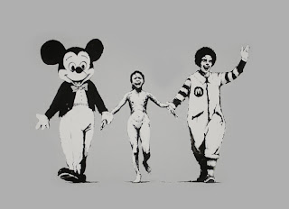
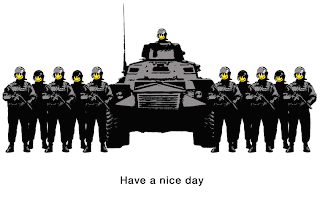
I personally think the works of these designers are strong and can be a bit confronting as some might call them vandals!!! But I think that they are more social commentator! And maybe propaganda artists more than vandals! As their works make a statement! and as it may be shocking to some, their views and designs are unique and their own... vandalism is not a major aspect of a lot of their works... especially Dominic Allen, as his are mainly photographic yet he still manages to put across political or personal or impersonal messages.
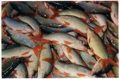
This photo of the fish I thik may set a political and “in your face statement about finshin and how much we actually take from the eath. The photo is large and detailed with a clear and defined visual impact on the viewers of discusting and dead fish. But I do not understand this to be vandalism,as we don’t know if he killed the fish or not! And my thoughts would say no!
I found this designer interesting and I got my info and my photo from thins website:
http:// www.dominicallen.com/DAphotos.html

TIMES UP BLOG CLOSED AFTER FRIDAY 22 JUNE AS MARKS HAVE TO BE LODGED


post 1 enviromental responsibility
BRITTANY
LUCY
post 2 united colours of benneton
KIM
BRITTANY
CATHY
post 3 whats the difference
LUCY
KIM
EMILY
BRITTANY
post 4 scratch it spreads
LUCY
KIM need 2
JACQUI
CATHY need 1
BRITTANY
post 5 olympic logo
LUCY need 3
JACQUI need 1
EMILY need 1
BRITTANY need 4 ALSO DONT HAVE YOUR SUBCULTURE ASSIGNMENT

Tuesday, June 19, 2007

Michelle
Scratch it and it spreads

Social commentators, propaganda artists or vandals?


The film RASH, offers a rare insight into graffiti artists’ world view.


RASH is a contemporary story of modern urban Australia and the artists making it a living host for illegal artwork called ‘street art’. This film explores the cultural value of unsanctioned public art, and graffiti’s contribution to a very public dialogue.

The images above have been taken from the streets of Melbourne, which has become an attractive place for both local and
visiting graffiti artists who arrive from interstate and overseas to leave their mark via bill posters, stencils, and performance to broadcast their under represented views.

RASH conveys the commitment, ideals and beliefs demonstrated in a thriving alternative art practice.
These artists bang away at the community conscience by sticking this artwork right in the public eye.
The spirit of rebellion is being channelled into street art and these visual conversations are spreading across the walls of Melbourne.

Michelle
2012 Olympic Logo

It took the design team a whole year to come up with this??


I think it looks like the work of a 5 year old.
To me it doesn’t represent anything to do with the Olympics.
Bright blue, pink, green and orange??
If the aim was to get the younger generation involved in the games, then why not hold a national design competition. Surely that would have produced something that the city could be proud of.

emily graffitti


Melbourne’s politically orientated stencils uncannily share similarities with the photomontage oeuvre of the 20th century Dada artist, Helmut Herzfelde. An ardent communist and pioneer of the photomontage technique, Herzefelde is better known by the name he choose to spite the German masses’ disdain for the English, John Heartfield.

“My aim here is not to provide a conclusive survey of stencil art in this city or a study of Dada photomontage. Rather, this essay seeks to illuminate the technical and conceptual similarities between the politically orientated stencil prints in this city and the photomontages of John Heartfield. I will demonstrate that for political stencil artists and Heartfield alike, the photograph serves as the primal unit for the construction of their work.”

Although the stencil image is printed with spray paint, a study of the processes involved in the creation and application of these stencils exposes strong ties with both photomontage and general photographic conventions. An analysis of a selection of Melbourne’s politically orientated stencils contrasted with some Heartfield photomontages will illustrate that the connection between the works goes beyond the technical to the conceptual. The works exhibit a shared political agenda and forthrightness in attacking their respective power structures, modes of life and governmental leaders. The stencils discussed will be shown to re-mediate Heartfield’s photomontage technique, taking its product from journal cover to the public space in order to subvert today’s key public communication media; billboard advertising and other commercial and civic signage.

Michelle
Cradle to cradle

It is time for our civilization to rethink the way we live, work, travel, design, build and consume. To think that we are doing our part simply by driving a hybrid car and recycling our paper, bottles, and cans is a dangerous illusion. For years, environmentalists have been telling us to do more with less in order to make change happen. This is simply not enough. We are going to have to fundamentally change the way we design our products, industries and cities. Our current recycling methods are inefficient and only serve to perpetuate the “cradle-to-grave” manufacturing model that we’ve been using for hundreds of years.

Architect William McDonough and Chemist Michael Braungart have published a revolutionary new book in which we adopt a cradle-to-cradle way of manufacturing that is as effective as nature itself in maintaining sustainability. The focus of their vision is for us to use nature itself as a model for manufacturing.
To prove their theory, Cradle to Cradle itself is printed on synthetic paper and bound into an innovative book format. The synthetic material is made from plastic resins and organic fillers that are waterproof and extremely durable. Not only is the book recyclable by conventional means, it can also be called a ‘technical nutrient’, which is an infinitely recyclable product.


Sources:
http://www.alternative-energy-news.info/cradle-to-cradle/

Monday, June 18, 2007

DAVID: DRUNK AND DESIGNER

Designer: Andrew Hagon
Company: WATERBOMB
INTERVIEWER: David Christie

Andrew Hagon has been studying and working as a graphic designer over the last ten years, he has been a close personal friend of mine all of this time. Andrew is self-employed and works on a freelance basis, he is contracted to several high-end advertising companies and does a lot of magazine work. Andrew is the person that told me that graphic design and graffiti are very different, while one compliments the other, there is so much more to learn by viewing both separately.

DAVID: How did you begin your career in graphic design – formal study or otherwise? Where did you study and how long for? Would you do that again or is there another alternative?
ANDREW: I was a graffiti artist long before I even considered graphic design, I often wondered how I could make my love of shapes and colours into money ha ha ha, it was mostly 80’s poster art that got me thinking about graphic design, any way I decided that I would give it a try, I enrolled in a private college as so I could do a degree in as little time as possible and have the best resources available to me, Two year and a few jobs later I graduated and begun selling my ass… Can we say that?
DAVID: I Guess…
ANDREW: Anyway to finish answering you question, it was a hard slog for sometime, and NO I would not do it again, I would just by magazines and cut out all the boring theory.
DAVID: You’re a top roll model mate ha ha ha… Now! How did you feel when you handed your first job to your first client?
ANDREW: to be honest with you at that particular moment I didn’t care it either was or wasn’t, but the days before hand and the late nights were fear filled, it something you can expect plenty of my friend.
DAVID: Get bent…
ANDREW: stop interrupting you interview or we will be here for hours. So when the final job was done, I knew that I had done my best with my interpretation of what my client wanted, I had back up options at the ready and I expected them to say it was shit. I had nothing to lose.
DAVID: You’re so brave ha ha ha… what are the Influences and inspirations of your design career?
ANDREW: I would have to say that my greatest inspiration is the stupid idea that I am about to discard when I am first given a design brief, there is always this far out random idea, that usually I would discard, but on the few occasions I have used it, there has been success. Other than that, the world, my surroundings, they are great influence, I just get around town doing my business with one subject on my mind and the answer generally comes. This may seem a little strange but it how I do my thang baby!
DAVID: Do you prefer to work within a team or on your own?
ANDREW: On my own generally there is more money in it, fortunately for you and me we have some very talented artists and designers as friends so when we are stuck it easy to find outside opinion and influence. In teams there always ends up being on part of the design that I am not satisfied with and it eats away at me. For example we did some stuff for INSIGHT me and a couple of other contracted designers, we all had different styles and INSIGHT wanted all three combined for the job. Whenever I see this particular campaign in mags or on bus stops there is a striped bit in the corner I fucking hate it kills me AAARRGGHHH!!!!
DAVID: dude my teacher is going to read this so please watch you language.
ANDREW: sorry… sorry miss….
DAVID: that’s better
ANDREW: good, now get on with it…
DAVID: wait did you want another beer?
ANDREW: Yes thank mate…
DAVID: What strategies do you have to cope with creative blocks?
ANDREW: um beer an pot… ha ha ha


DAVID: c’mon now… seriously!
ANDREW: I will take my mind of the subject for 24 hours, and toward the end of this period, generally while I’m falling asleep, IT COMES TO ME! And I just put it in my Dictaphone.
DAVID: What kind of design work have you found to bring in the bread and butter?
ANDREW: I do a lot of photo touch up, I call it image pimping, for magazines, basically I get a dull image of a car and a city scape and I make it look like the shiniest most amazing picture you have ever laid your eyes on, mostly just stuff I have learned messing around on Photoshop.
DAVID: What does your pricing structure include; e.g. fuel costs, hourly rates, materials cost, advertising etc…?
ANDREW: I believe that as a successful designer you obviously have a talent, which means that everything that you design is unique, this is where its value is derived from, it has a certain Andrew Hagon feel to it.
Generally I am very generous to my self when it comes to quoting, because I put a lot of time into my work, if I am given a deadline that mean crunching my time, I will charge accordingly, I was told once that if I did a cheap job for a man he would be the only the one who told everybody.
DAVID: How do you sell yourself? Do you have a website or regular advertising channel?
ANDREW: It’s kind of a weird thing, it seems to me that the more you advertise the worse the jobs are, I am more reserved, I believe that by being 100% for the client, your work speaks for itself, I know I have asked about who had done someone’s graphic work before, have you?
DAVID: Yes.
ANDREW: well then, that proves my point; your work should speak for itself.
DAVID: I have learnt an incredible amount doing this interview and I thank you for you time.
ANDREW: Gees your full of it.
DAVID: Why yes I am.

Wednesday, June 13, 2007

ELLICE ZOIZ? Huh?


What is it..? that was my initial thought. Ugly! That was my following thought and “What the *#@!” was, and still is my thoughts now.
ZOIZ… whats that meant to mean?

"We will host a games where everyone is invited to join in because they are inspired by the games to either take part in the many sports, cultural, educational and community events up to 2012 or they will be inspired to achieve personal goals," added Lord Coe.

How is this ugly logo meant to inspire anyone when it makes so many of us feel sick when we look at it. (Not to mention those who suffer epileptic seizures from the flashing brightly coloured T.V ad!) Staring at the logo itself for too long could make any of us have a fit.

I hate the use of bright pink and don’t see how this ties in with anything olympic. I guess the metrosexuals and the girly girls will love it, from a marketing point of view but from what I’ve been hearing and reading this ‘artistic flop’ has only caused resentment from the majority of us.
If they are really trying to inspire the younger, up and coming generation they really should have thought about the colour a little more because I can’t see young boys being inspired by something that bright pink, can you?

It’s all just another big money making scheme that’s going to make the rich richer!. I feel they chose to release this logo knowing how much ruckus they were going to cause and the amount of attention they would gain from it and that’s exactly what they were after.

http://sport.guardian.co.uk/london2012/story/0,,2095525,00.html

ELLICE: Perception is Determined by Circumstance

So Let’s say if you were the owner of a building that has just been sprayed with a tag without permission, your perception would be "that’s vandalism."
However if you’re the one with the spray can in hand and a burning desire to express yourself then it’s simply a blank canvas of opportunity.

Graffiti is a blunt reminder that two worlds existed simultaneously and the debate about whether its vandalism or art is the link between these two worlds and for as long as man is on earth this debate will continue.

I think that ‘art with a message’ is what it’s all about. Something that makes us stop and think, perhaps about the who, the why, the how or the what.... It could be a stab at the government, taking the piss out of celebrities, personal opinion- trying to have a say in this world of madness and ignorance we live in or it could be even to simply present artwork with personal meaning for all the public to share.

Street artist Banksy is a good example to use for this. Personally I admire his talent and effort put into each piece he creates and to remain anonymous, that’s an achievement. He creates stencil art with so much meaning that I think sometimes it’s not until the third or fourth time you look at a piece that you start to realize what message he is trying to portray. Each person has a different opinion on everything so when it comes to art on the streets the meaning will always differ from person to person and I think that’s the exciting part.


I think that people need to accept, understand and embrace the street art culture a little more as it’s now and forever will be growing movement in the art scene.

post6: no new post -comment on others posts

this week and next week make comments on others posts

Monday, June 11, 2007

Fe. Play School 2012


It sound like this logo is inducing epileptic seizures in those who suffer with epilepsy and inducing vomiting in those who don’t suffer from epileptic seizures. It’s interesting to see how many people loath it. There are only a few comments about liking some aspect of it.

I personally think that using 80’s fluoro is tacky. It will be lucky to see one fashion season out, little lone to last until 2012. The logo design reminds me of cardboard cutouts that they might use to paste something up on in playschool. At best it looks like a year 6 primary school project. I know that sounds pretty tough but I think if anyone of us produced a design like that logo for Stacy we would definitely get comments on how it could be done a little better. And so she should. I think if we were given one month to come up with a better design, we could do better than this top London design company has done in twelve months. That’s not a challenge. I just don’t like it. Have a close look at the d in London. What’s that? I drew like when I was twelve.

Kiss revival,
Map of Australia,
This way around the bend,
and What is it???.

This is my logo in response to the London logo.
Fe

Sunday, June 10, 2007

Jaymi: spray the town red

Graffiti and street art have been around since ancient civilization to the present. But the motivations drive street artists have been and are varied.

Today some see urban space as a format for their artwork, taking it outside the gallery and into the streets to reach a wider audience so that more people see it not just those that go to art galleries. Making Street art accessible to everyone. Whereas others like the risk factor involved in making graffiti getting the adrenalin going, the pure thrill.
Personally I like art that makes me think. There is a strong current of activism and subversion in street art. Street art says what goes unsaid. Street Artists are social commentators voicing other opinions not often seen in mainstream media. It is effective in places where people have limited freedom of speech and rights street art gets the word out and expresses opinions and highlighting injustices. Applied in the right way street art challenges and makes us question the very foundations of our society.
Infamous UK street artist under the guise Banksy wrote, “Imagine a city where graffiti wasn’t illegal, a city where everybody could draw wherever they liked,” he once wrote. “Where the street was awash with a million colors and little phrases . . . A city that felt like a party where everyone was invited, not just the estate agents and barons of big business.”
http://www.banksy.co.uk/menu.html