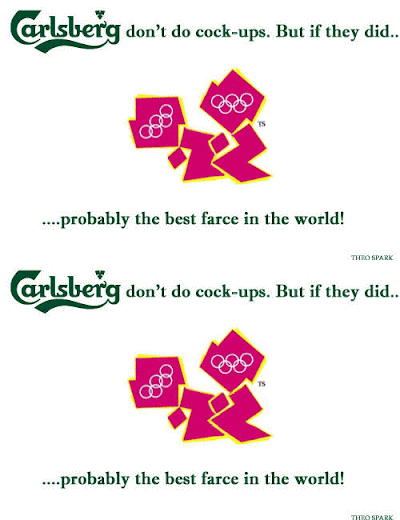
its been amusing reading everyone's responses to the new logo design for the 2012 london olympics. i like an opinion and an articulate, strong, imaginative, robust, evocative and colourful one (opinion, that is) i like all the more so. i can't add too much to the genius already expressed by my fellow students...so, i'll be brief...i think the logo is ummmmm...bright, neon bright. neon is "cutting edge" so i guess that rates as, well...cutting edge. i think it's ugly. but that may well be cutting edge too. being aspiring designers we gotta pray to the "god of cutting edge" (even if its only when we're desperate for inspiration) and...i think we may grow to love it no matter how much we criticize it now....
i found this little animation...a picture really does say a thousand words...
http://theospark.blogspot.com/2007/06/london-olympics-logo.html
references:
http://theospark.blogspot.com/2007/06/london-olympics-logo.html
http://i184.photobucket.com/albums/x41/theospark/Olympics2.gif
http://nytimesbooks.blogspot.com/
3 comments:
It really is ugly!
i love the picture you used at the start!!! and yes..i agree with your blog. nicely written
your not going to get off so lightly ..i d like to know what you mean by cutting edge. to me it means breaking new ground. 80's inspired ...been there seen that, digging up the past that maybe best left buried at least a bit longer. the only thing cutting edge is the fuelling of discussion. when can you remember a logo creating such an impact to the average person. the purchase of jackson pollack's blue poles had a similar impact.
Post a Comment